Components
Table of Contents
Intro to Components
Components allow you to maintain a consistent, efficient, and scalable website by creating customizable blocks from elements and child elements. Reuse those blocks across your site, and modify them in a single place to avoid individually revising each recurring layout. Throughout Lumos components are used for Navbars, Footers, Buttons, and specific sections or layouts like a CTA section. This page should get you up to speed on how to edit components and also includes a list of the components used in this site below. For a full guide on using components check out the Webflow University page.
How to Edit a Component
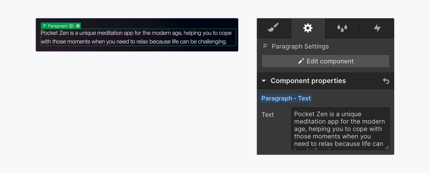
To make the same changes across all instances of a component, you’ll need to edit the main component. You can edit the main component on any component instance by:
- Double-clicking the component instance
- Right-clicking the instance and choosing Edit component
- Selecting the instance and clicking the “pencil” icon in the label
- Selecting the instance and clicking the Edit component button in the Style, Element settings, or Interactions panels
- Selecting the instance and using the keyboard shortcut Enter
When you do this all other elements on the page will get a dark overlay to show that you are updating the main component and that any changes to it will affect all other instances of that component.
Understanding component properties
Component properties let you define specific elements within a component that can be modified with unique values on a component instance. For example you could make a CTA section that has an editable title and button. In more advanced use cases component properties can also show and hide specific elements, or even change visual styles (like button style, spacing amounts, or section color).
To edit a content property (eg a heading or image) you should:
- Locate the component instance that contains the element whose values you want to modify
- Select the element on the canvas
- On the right side of the designer you will see a properties panel - most section components will have a large amount of properties sorted into different dropdowns, you can open and close these to just look at the specific type of property you are wanting to update (eg Heading properties)
- Modify the element’s property values (e.g., update the text, replace an image, set the visibility, etc.)
Note: Some components (like a Navbar) might not have any properties set up because instead of having the component include different content on each page it needs to be consistent across the site without any parts of it changing.
Updating styles within a component
Lumos allows you to update visual styles within some components by using component properties. Since each component property is given a name (and often a placeholder) use this to understand what modifying that property will do to the visual style. For example, if you click on a button component below you'll notice it has a property called Small — which is set to false by default, but if type in true instead the button gets smaller. The same thing applies to the property color mode, by default it is set to 1 but if you change it to 2 the style of the button changes.
Feel free to play around with these properties when modified a component to see what visual changes are available. That being said it is recommended to clear out any overrides of a property if it is not having any effect. Eg. don't write something the doesn't work into a Color Mode property like dark or 10 if those options don't do anything, just leave the property blank (you can click on the blue text in the property to reset it).
Component Naming Conventions
One other thing you'll notice is that components have different types of names related to how they are used. Often this will include several words or phrases separated by a slash. This is to help you quickly search through and add components. The most common keywords are explained below:
- Global - These are components that are used inside other components or in component slots throughout the site, they are building blocks that can also be used within layout components.
- Section - These are pre-built sections that you can drop onto a page and have specific style controls for, when creating new pages they will help you quickly fill out the pages with prebuilt responsive designs
- Page - These are page related elements like the core structure or custom code that will exist on most pages.
- Layout - These are layouts that include slots for other components, allowing you to have more flexibility in the amount of content included - they are more advanced as they require an understanding of CSS Grid and Flexbox
- Inner - These are components that are made to fit inside component slots, they don't include section structure and are made to give you more control over the amount and type of content within certain layouts.
- Important! - If a component starts with a layout/section name it is meant to only be used in that layout (eg A Feature / Card should only be used within a Section / Feature section
Grid Layouts & Slots
Webflow also allows you to create components that can hold other components using slots. This makes components very powerful and modular and can allow you to make a wide variety of layouts possible.
In this build if a Layout component contains the word grid you can put other types of content components within that grid to make it even more custom. A couple of important notes on grid layouts:
- Every customizable grid will include a Grid Class property that gives you options to set how many columns are in it. You can change the grid layout field to any of these options, giving you customizability for how they respond across breakpoints
- u-grid-column-2 (2 column on desktop and tablet, 1 column on mobile)
- u-grid-column-3 (3 column on desktop and tablet, 1 column on mobile)
- u-grid-column-4 (4 column on desktop, 2 column on tablet, 1 column on mobile)
- u-grid-autofit (will auto fit the amount of columns based on the minimum rem value of each column)
- u-grid-desktop (12 column grid on desktop, vertical flex tablet and down)
- u-grid-tablet (12 column grid on desktop and tablet, vertical flex on mobile)
- u-grid-landscape (12 column grid on desktop, tablet and mobile landscape, vertical flex on mobile portrait)
- Along with the amount of columns you can also change the grids gap, gap options include:
- none
- xsmall
- small
- regular
- medium
- large
- If you want to change the span amounts of elements within a grid simply drop a Inner / Grid Child component into the grid and you can customize how it spans across breakpoints and its visibility and order as well. Then put content components within the grid child slot.
Lumos Chrome Extension
If you are using components a lot I would highly recommend installing the lumos chrome extension - It will pull out values from the custom code to make it easier to see what your options are when modifying a components styles. Chrome extension is linked here.
Components in this site
The components used in this site are displayed below, feel free to copy and paste them onto new pages or modify them to familiarize yourself with each of their options. Note: The navbar is not included on this page but you can find it on almost any other page throughout the site.
Global & Inner Components
Heading
Lorem ipsum dolor sitipiscing elit. Suspendisse in eros elementum tristique.

List Heading
Lorem ipsum dolor sitipiscing elit. Suspendisse in eros elementum tristique.
Card Heading
Lorem ipsum dolor sitipiscing elit. Suspendisse in eros elementum tristique.

Heading
Lorem ipsum dolor sit amet, consectetur adipiscing elit. Suspendisse varius enim in eros elementum tristique.
Lorem ipsum dolor sit
Lorem ipsum dolor sit amet, consectetur adipiscing elit. Suspendisse varius enim in eros elementum tristique.
Lorem ipsum dolor sit
Lorem ipsum dolor sit amet, consectetur adipiscing elit. Suspendisse varius enim in eros elementum tristique.
Card Heading
Lorem ipsum dolor sitipiscing elit. Suspendisse in eros elementum tristique.
Card Heading
Lorem ipsum dolor sitipiscing elit. Suspendisse in eros elementum tristique.
Card Heading
Lorem ipsum dolor sitipiscing elit. Suspendisse in eros elementum tristique.
Card Heading
Lorem ipsum dolor sitipiscing elit. Suspendisse in eros elementum tristique.
What We Do
List Heading
Lorem ipsum dolor sitipiscing elit. Suspendisse in eros elementum tristique.
List Heading
Lorem ipsum dolor sitipiscing elit. Suspendisse in eros elementum tristique.
List Heading
Lorem ipsum dolor sitipiscing elit. Suspendisse in eros elementum tristique.
Lorem ipsum dolor sit
Lorem ipsum dolor sit amet, consectetur adipiscing elit, sed do eiusmod tempor incididunt ut labore et dolore magna aliqua. Ut enim ad minim veniam, quis nostrud exercitation.
Lorem ipsum dolor sit
Lorem ipsum dolor sit amet, consectetur adipiscing elit. Suspendisse varius enim in eros elementum tristique.
Lorem ipsum dolor sit
Lorem ipsum dolor sit amet, consectetur adipiscing elit. Suspendisse varius enim in eros elementum tristique.