Designer Guide
Table of Contents
Getting Started
This page is built to be a reference page and instructional guide for how to work within the Webflow designer in a way that keeps this website organized and clean. It is recommended to view this page on the live url so that you can see the populated table of contents (left), and navigate through the page more easily. Note: All the pages in the Style Guide folder are set to not be indexed by search engines so website viewers won't stumble across them.
What is Lumos?
This Website is built using the Lumos design system which is a method for building websites that helps provide consistency and promote best practices for Webflow development, it is recommended that if you are consistently working within the Webflow designer on this site you read through this entire page.
That being said, If you are just needing to update content throughout the site it is recommended that you skip to the page on Components so that you can get comfortable using and updating components. Between using Components and updating the CMS you should be able to make 95% of the changes you need to your site without having to create or modify classes which makes the other information on the design system unnecessary for your role.
Note that this is an advanced framework that utilizes more custom code than most other frameworks, while it has significant benefits when it comes to site speed, design consistency, and maintainability it does mean that there is a higher learning curve compared to some other Webflow systems.
Why bother reading this?
While you could definitely go into this project and start making updates without reading this guide doing so will quickly make the website much less organized, harder to update in the future and could potentially break or modify parts of the site in an unintended way so it is much better in the long run to take the time to read through this page before making edits to the website.
Lumos Core Principles
The core principle of the Lumos system is DRY or Don't Repeat Yourself. This is a term borrowed from traditional Web Development that is often hard to implement in Webflow. Using standard methods of building in Webflow one ends up creating a lot of classes that have overlapping styles, (as an example, your buttons, cards, and images might all share the same border radius but each of them need unique classes). There are several issues with this:
- If you want to change that value there are multiple places you need to do it (and the larger a site gets, the more convoluted this can be).
- It increases the size of the CSS file which slows down page speed and performance.
- It can more easily create design inconsistencies where someone updates one instance but misses others.
Lumos addresses this by creating a variable and utility system that is versatile and quick. This combines the power of global utilities with the ease of creating custom classes in Webflow for a truly flexible and scalable combination.
Class Naming
As with any good development system one of the key aspects of Lumos is class naming. In Lumos there are three types of classes used, each with their own purpose and naming convention (each type is explained in detail below).
- Component Classes
- Utility Classes
- Combo Classes
Component Classes
Component classes are the main type of class that you will be creating if you are making new layouts or sections. They define groupings of elements that are used together eg:
header_main_wrapheader_main_titleheader_main_image
Generally each section will be its own component and may include components within it depending on its complexity (for example a form within a contact section could be seperate component).
Naming Component Classes
The role of a component class name is to give a clear and concise understanding of what the class is used for. Ideally when a designer looks at a class name they should be able to understand where that class is used and what its role is.
The most common types of classes are component classes. These define a group of divs that work together to form a specific layout or item (a header, navbar, slider, blog grid etc). Component classes should follow the naming convention of: type_varation_element
Type: most general category for component (hero, slider, content, footer)
Variation (optional): used for multiple components of the same type
Element: individual component part.
Some examples include: btn_play_icon, hero_main_title, footer_wrap.
Guidelines for Component Classes
- Shorter is better, generally keep the identifier to 3 words or less.
- Use underlines to separate words.
- No spaces, capital letters and don't start the class with a number.
- Abbreviate when need be. Using
bginstead ofbackgroundandimginstead ofimagecan help keep classes shorter, but try to make sure that the abbreviations are clear and not confusing.
When working with class names you may see some common keywords popup, using these keywords helps provide consistency across a build and can make it easier to decide on a name when creating new classes.
Common Keywords
wrap- Any class with this keyword is the outermost div of that component, layout or structure (eg,cta_wrap). In most cases unique classes within that wrap will start with the same class identifier (eg.cta_layout,cta_image)list- Any element that is holding multiple divs (generally of the same type like cards, faq's collection items).space- An element that adds spacing to be used throughout the site, generally used for vertical padding (eg.space_button_main)title- Large heading for a specific layout (it will get a text utility like fs2 that can easily be changed across all instances of that layout)sub- Small heading for a specific layouttext- Small textratio- A div to wrap images and give them a specific aspect ratio using padding top %input- A form input fieldlabel- A form field label
Custom vs. Global Components
Global components can be used inside any section or other component throughout the website. They keep the style of repeated elements consistent site-wide. Start with g_ to indicate a global component eg g_eyebrow_wrap.
In Lumos, custom components are the typically the preferred choice. Custom components are any component that doesn’t get used inside other types of components. With custom components, any style changes we make only affect instances of that section or component throughout the site.
However, global components are often a necessity to keep certain styles adjustable globally across multiple sections. Global components create a similar issue to traditional Webflow utility classes. The pros & cons should be weighed carefully before choosing a global component over a custom one.
Utility Classes
The second main type of classes in the Lumos system is utility classes. These classes are always stacked on top of a component class and are used to add some pre-defined styles to that class, (like font styles, grid settings, or global container settings). Utilities follow some important rules for consistent usage:
- All utilities start with
u- - Utilities use dashes instead of underscores.
- Utilities are always added to a component class (eg
hero_main_imageu-full)
Updating values within utility classes
When modifying a utility class there are two options, each of which have a different effect. If you're wanting to update the utility class and have it make changes to wherever that utility is used on the site make sure you go to the style guide page, and select that specific utility class to update it. Alternatively if you're wanting to update a specific component to utilize a different utility, (maybe you want all of your contact titles to use u-h1 instead of u-h2). In that case, do this by updating the name of the utility class. Just rename the second class to match the name of the utility you want to reference instead, this will update all instances of that combo class (note, if it give you an error saying this class already exists, just rename the utility to u-, hit enter, and then rename it to the utility you want to use.
Note: when you make changes to a class pairing like, about_title u-display, those changes will only apply to that specific class pairing so you can freely update font sizes, weights, and more as needed without changing the default display heading style.
For a list of all the utility classes you can use check out the styleguide page.
Combo Classes
Combo classes are when an additional class is added to a base class to further customize it or add a slight variation without utilities. In Lumos, combo classes always begin with the is- prefix and is followed by one or two keywords explaining what the combo class does and then any relevant utilities. Eg: gallery_item is-large.
This can be useful for creating slight variations of a class, as a general rule, do not add combo classes and utility classes to the same component class.
Key Takeaways
- When you're naming a class make sure you follow the proper convention depending on its type (component, utility, or combo).
- Make sure class names, are clear and concise.
- Whenever possible use utilities and utility classes to keep styles globally manageable and to style elements more quickly.
- Utilities are controlled in the variables panel and the custom code
Variables
A huge benefit of the Lumos system is the variable system. These allow you to apply styles to an element in a way that is globally manageable and helps to keep the entire site more consistent and scalable.
The Lumos variable system is basically a bunch of re-usable values used throughout the website design. These can be anything from font weights, to border radius's to background colors. Most of the variable values are created and managed in the Webflow variables panel, but some are also modified in the custom code component. For more information on what kind of styles use variables keep reading below.
When applying variables to a class this can be done one of two main ways:
1. Referencing variables in the Style Panel
Webflow variables can be referenced by clicking into an input in the style panel (like top margin, and then clicking on the purple + icon and selecting the variable you want to use eg size/1. This will use the variables value for that property. In some cases variables aren't supported yet in the default styles panel input (for example font weight). In this case you need to scroll down to the Custom Properties section and type out the CSS property name and the full variable name. eg: font-weight: var(--body--font-weight)
2. Adding a utility class to a component class
If you are wanting to apply a bunch of variables at once (like in the case of typography styles where you want to adjust size, weight, line spacing, and more) you can add a utility class on top of your component class eg blog_title u-h2. This will add all of the variables from the utility class to your component class allowing you to quickly style that element, while still giving you control to override specific properties as needed.
Using variables vs custom styles
As a general rule you should use variables for all of the following styles in order to keep the design system consistent and ensure the the site is globally manageable.
- Typography (Font family, size, weight, capitalization, letter space, line height)
- Color (typography, background, border, outline, and stroke colors)
- Page structure (Page padding, container max widths, section spacing)
- Sizing (Sizes for padding, margin, grid and flex gaps)
- Miscellaneous (Transition duration, border radius, border width, pointer events, absolute images)
You will use custom styles for the following CSS properties:
- Display (Block, Flex, Grid)
- Layout (Text and layout alignments)
- Width and Height
- Miscellaneous (opacity, overflow hidden, anything not listed in the list of variables)
Core Structure
Every page on your website uses the following core structure. It uses several different layers of Div Blocks and each layer has a specific use in helping you to create a web page. Below are descriptions of each of the classes used in the core structure so you can understand what their role is and use them appropriately.
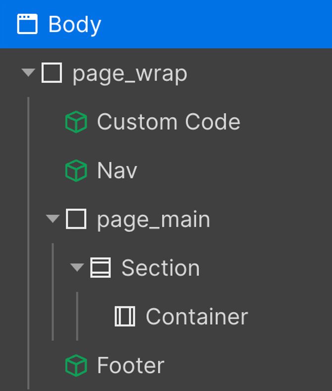
Page Classes
page_wrap - The page wrap class holds every element on the page and is useful for copying and pasting content between pages, on some websites it can also be useful for providing styles to the entire page.
page_main - The main content of the page. Use a <main> HTML tag that wraps all or most of our website content sections. The nav, footer, and custom code symbols should not be inside this main tag.
blog_list_wrap - Lumos uses the default webflow section elements since it is already given a <section> HTML tag. Sections should be given a class name that matches their component and the class name should end with wrap.
blog_list_contain u-container- Lumos container elements are given a unique component class and then the container utility class on top of it which applies default properties (max width, vertical and horizontal padding). Then those values can be overriden for that specific combo class if different padding or spacing is needed. Containers can also use data attributes to control vertical padding within components (more on this in components)
The Custom Code Embed
The custom code embed is at the core of the Lumos system — it is used to control several of the variable values and to provide default styles to elements across the site (sections, headings, form elements and more). The Custom Code component should be at the top of every page as the first child inside of the page_wrap. If you need to update the values of the color themes that is done within the custom code embed. If you don't understand CSS I would recommend not modifying any of the code and contacting your webflow developer to take care of those edits for you.
Key Takeaways
- Follow the above core structure for all pages in the site.
- Use the default Webflow section and container elements as they have default styles that will speed up your workflow.
- The Custom Code component should be present on every page as it controls the Lumos utility system.
Typography
Typography should be our project's most simple and organized type of utility system. Websites with unified typography systems help us to be clear to the user. HTML typography tags contain our default typography values.
Sometimes when you are working with typography the design style you are wanting to use for an element does not match the html tag you should use for SEO.
For example, you need to use an H1 tag for the page's title. The H1 is required for SEO and page crawling. However, the styles of this title should follow the H2 styles of the project. This creates a conflict where the SEO-required Heading tag needs the default styles from a different heading tag. You can apply u-h2 to the H1 element to mimic the H2 style while maintaining the H1 tag for SEO.
Type Utilities
The entire typography system is controlled in the Webflow variables panel, this allows you to control all of the global type values like font families, line heights etc, and also control specific type styles (like all h2's throughout the site).
For a more detailed explanation on how to update the Lumos typography system check out the Timothy Ricks tutorial below:
Color
The color system in Lumos is built around design system best practices allowing you to re-color pages, sections or elements by changing the color theme attribute inside of them. Color modes apply a new background, border, and font color to an element. They also define selection, border, text stroke, and outline color for all children inside the mode.
swatches - The swatch variables define the global colors used throughout the site and are referenced in the Custom Code embed to define the color themes. As a general rule, don't apply swatch variables to any elements on the site.
theme - The theme variables are used when applying colors to elements on the site and will ensure that elements automatically adjust when parent color modes are changed.
The color themes are controlled within the Custom Code component and can be updated there to define the colors used for each theme. The color theme can also be adjusted on most section components for a more
Applying Colors
Thanks to default styles, adding a mode class to an element will give all children inside a default border color, outline color, text-stroke color, and font color (it will also recolor secondary colors within these elements as well if they are setup (eg, a class that uses theme/text-2 will have a different secondary text color depending on the parent theme. To override those defaults or set an different color on elements, we can use the color utilities (view in the Style Guide or Lumos Docs). In general use the theme background, text and border colors to apply colors throughout the site. If unique elements require their own responsiveness to themese (like buttons, or links) these can be setup using separate variables for more precise control.
Changing theme
The theme of a page or section can be changed by updating the data-theme attribute. The default value is light but you can also set it to dark, inherit or reverse.
Sizing
The Lumos system comes with a wide range of sizing variables allowing you to change margin, padding, column and grid gaps. Each of the sizing utilities are responsive on tablet and mobile screen sizes and will automatically shrink on smaller viewports, they are named using size/1 with the number matching the rem value on desktop. (eg size/8 will give an element a bottom padding of 8 rems).
These sizing variables are also used to set typography sizes, section padding, default grid gaps and more.
Unit Types
The Lumos system uses rems rather than pixels as the default unit of measurement. Using rems is an important part of web accessibility and making sure that your site is usable by anyone on the web. That being said, there will instances when you need to use percents (eg. for filling a layout), vw or vh units (eg. to fill the entire viewport), ch (eg. to restrict heading width based on character count) or even pixels (eg. for small lines or borders). It is important to be thoughtful about which unit you are using an why because each unit has its own pros and cons.
Key Takeaways
- The Lumos size variables are responsive so all spacing sizes will decrease on tablet and mobile by default so use these variables whenever possible.
- Use rem as the default spacing value rather than pixels.
Layout
Lumos also comes with two layout systems that utilize utility classes to make it easier to faster to make and globally adjust layouts across the site. Timothy Ricks has great videos explaining them so I've just embedded them below for your reference. If you come across utility classes that have the words grid, flex, gap, or column these are related to the layout system so check out these videos before modifying them.
Resources & Acknowledgments
That is the end of this guide to Lumos, as was said at the beginning, this didn't cover every aspect of the Lumos system and reading through the entire documentation and watching Timothy Rick's tutorials on Youtube are highly recommended as they will teach you a lot about how to be a better webflow developer.
Hopefully this guide has been a helpful resource in learning how to better edit your website and also learn best practices for Webflow at the same time. If there were aspects of this that were confusing or poorly worded please reach out and let me know.
The Lumos system was developed by Timothy Ricks.
This page was created by Caleb Raney the Webflow designer who built your website, if you have more questions as you read this and are working within your website feel free to get in touch.
You can reach me at my website or by email